
Introduction
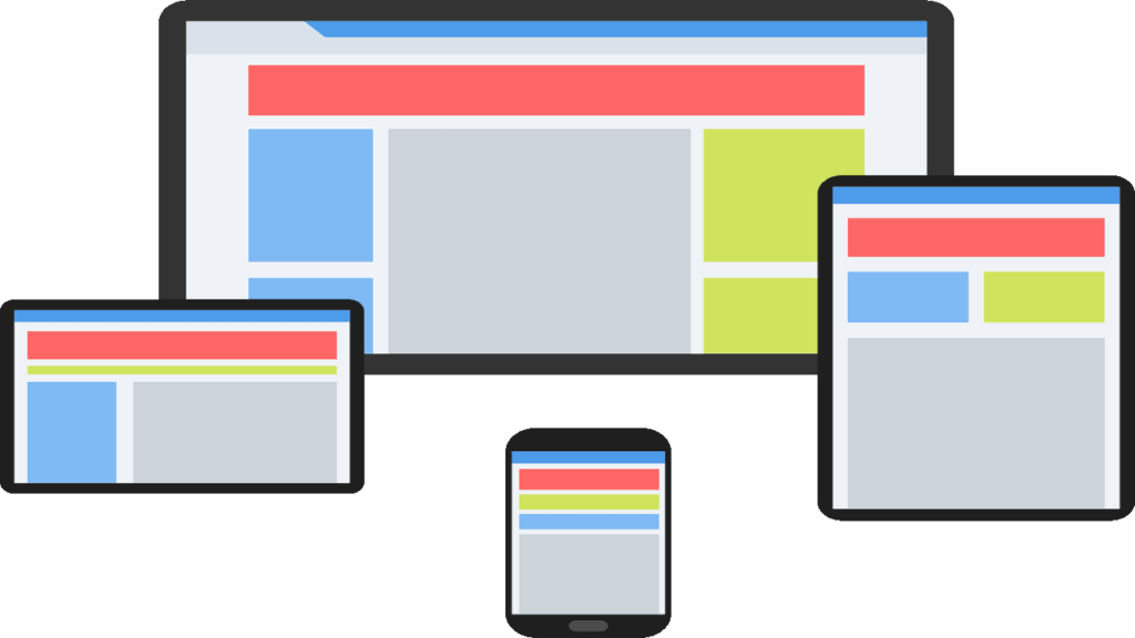
In this tutorial, we’ll guide you step-by-step through responsive design techniques using Flexbox, CSS Grid, and Media Queries—fundamental tools every developer needs in today’s multi-device world
What You’ll Learn in This Tutorial
- Basics of Flexbox, CSS Grid, and Media Queries
- How to create responsive layouts using these techniques
- Step-by-step instructions to implement these concepts from scratch
Prerequisites
This tutorial is designed for beginner-level developers who are comfortable with:
- Basic HTML and CSS
- The concept of web design
Getting Started
Before we dive into Flexbox, Grid, and Media Queries, ensure your project structure is set up:
- Create a basic HTML file (index.html):
<!DOCTYPE html>
<html lang="en">
<head>
  <meta charset="UTF-8">
  <meta name="viewport" content="width=device-width, initial-scale=1.0">
  <link rel="stylesheet" href="styles.css">
  <title>Responsive Design Tutorial</title>
</head>
<body>
  <header>
    <h1>Responsive Web Design: Flexbox, Grid, and Media Queries</h1>
  </header>
  <main>
    <section class="container">
      <div class="card">Card 1</div>
      <div class="card">Card 2</div>
      <div class="card">Card 3</div>
    </section>
  </main>
  <footer>
    <p>Adventures in Dev © 2025</p>
  </footer>
</body>
</html>
- Create a simple stylesheet (styles.css):
* {
  margin: 0;
  padding: 0;
  box-sizing: border-box;
}
Responsive Layouts with Flexbox
Flexbox is a CSS layout module designed for 1D layouts—one-dimensional arrangements (either rows or columns). Here’s how to use Flexbox to make our .container responsive:
Step 1: Set up the Flexbox container
In styles.css, let’s start by defining .container as a Flexbox container:
.container {
  display: flex;
  flex-wrap: wrap;
  justify-content: space-between;
  gap: 20px;
  padding: 20px;
}
Explanation:
- display: flex: Defines this element as a Flexbox container.
- flex-wrap: wrap: Allows items inside the container to wrap onto a new line as needed.
- justify-content: space-between: Distributes items evenly along the main axis (horizontal direction).
- gap: Creates space between flex items.
Step 2: Style the items inside the container
Now we need to style the .card elements, so they become responsive:
.card {
  background-color: #4CAF50;
  color: white;
  padding: 20px;
  flex: 1 1 200px;
  text-align: center;
}
Explanation:
- flex: 1 1 200px: Makes each card flexibly take up space, but never smaller than 200px.
- flex: 1: Tells the cards to grow and shrink based on the container size, ensuring flexibility.
Now, your layout will be responsive on larger screens and adapt to smaller screens like mobile, breaking into multiple rows when necessary.
Advanced Layouts with CSS Grid
CSS Grid allows for 2D layouts, so it’s perfect when you need more control over both rows and columns.
Step 1: Define the Grid container
Change the .container style to use CSS Grid instead of Flexbox:
.container {
  display: grid;
  grid-template-columns: repeat(auto-fill, minmax(200px, 1fr));
  gap: 20px;
  padding: 20px;
}
Explanation:
- display: grid: This enables the grid layout.
- grid-template-columns: Defines the number of columns in the grid. auto-fill ensures the layout adapts to the container width, and minmax(200px, 1fr) allows the cards to be a minimum of 200px wide and take up available space equally (1 fraction of the container width).
Grid’s beauty is in its simplicity. The layout adapts automatically to varying screen widths without extra work.
Making the Design Fully Responsive with Media Queries
Now, to truly ensure that your design looks great on all screen sizes, we’ll use Media Queries. These are used to apply different styles based on the device’s screen size or other characteristics like orientation or resolution.
Step 1: Add Media Queries for Smaller Devices
At the end of your styles.css, let’s add media queries:
@media (max-width: 768px) {
  .container {
    grid-template-columns: 1fr;
  }
}

@media (max-width: 480px) {
  header h1 {
    font-size: 18px;
  }

  .card {
    padding: 10px;
  }
}
Explanation:
- The first query @media (max-width: 768px) adjusts the grid to one column instead of multiple columns when the screen is 768px wide or less (tablets and large phones).
- The second query @media (max-width: 480px) targets even smaller devices like smartphones, adjusting text size and card padding.
These adjustments ensure your layout remains usable and aesthetically pleasing on small screens!
Final Output and Testing
Now, we’ve used Flexbox, Grid, and Media Queries to create a flexible, responsive webpage. The next step is testing! Ensure your site looks good on different devices by resizing your browser window or testing in various device emulators.
Why Responsive Design Matter
In this tutorial, we highlighted the essentials of responsive web design, empowering you to create layouts that work on all devices. This process:
- Enhances usability: Making websites adaptable improves the user experience.
- Broadens accessibility: People access websites from various devices, and responsive design ensures all users have a great experience.
- Optimizes your code: Flexbox, Grid, and Media Queries offer maintainable, simple solutions for most layout challenges.